Don't Make Me Think chapter 1

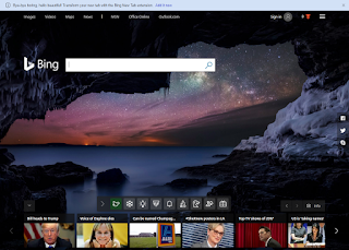
 This makes you think because you can't tell if the logo is or is not a link. Also the titles look like links but are not obvious.
 This makes you think because the Bing logo does not look like a link but it is. Also the icons are not standard so you have to think what they are.
The red heading looks kind of like a link but it is not clear. The black text does not look like links but it is.

Comments

Popular posts from this blog

Zoe's Zebras Logo

I was told to make a logo for Zoe's Zebras, And at first I was going to make it a zebra shop. Then I thought that that did not make because selling zebras is probably illegal  so I turned it into a wildlife protection agency for zebras. That is why I chose the shield. I chose the double Z and the single Z designs for obvious reasons but The one that looks like an hour glass was a Z that I accidentally joined, but it looked like a nice logo so I kept it. The top ones are nice and smooth but the bottom ones have missing patches to look like a zebra.

House Project

  In this project we used SketchUp to create a house from a floor plan. You first create a rectangle the size of the floorpan. Then you Make the roof. The hardest part was the patio because of all the spacing between the bars.

Personal Logo

I designed a personal logo in illustrator. I used hexagons because they symbolize connectivity and communication and I hope to work in those fields. On the left is the finished logo and on the right are all the parts of the logo. I really enjoyed making a logo and working in the symbolism to convey a purpose.